2010年11月29日 星期一

Business Card Designs.


A business or company or personal card design is very important because it helps showing the information to people who look at it and give people different impression to the company or the person. Most importantly, it provides their contact and knows more about the business. Thus, information on the card should be clear enough for people to see easily. The color use or picture used should be relevant to the theme. Here’s a bad example of a Fulbright chair company. We can obviously see that even though there is a clear picture showing what’s the business about, the wordings are so small and totally congested together and hard to see. The focus point when I look at it would be “BUILD your own JET ENGINE!” It will be better if the name of the company put at the top instead.
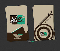
However, there’re still a lot of good examples. I have 3 beautiful business cards. One is from graphic designer, Sean Kinberger. We can see it’s very simple, emphasize more on the contact of the person. Moreover, the repetition of ‘SK” also helps reduce the dull design. The use of color is also very nice and clear.  The second one is a very beautifully made card from this store “KATSUYA”, The simple of wordings on the wood surface are very clean and fresh and viewers can get the contact very easily . The final card I want to show is the card from Dewight Williams, a director of operations. I surely love how simple the design is and the use of simple shapes helps bringing the dynamic feeling to the whole piece. The color use is mainly brown and blue green, very simple, very clear.
Text gives the direct message to design.


Apparently type is a very important element in a design; it’s the most direct way to tell the message of the design. Texts are always one of the main design elements that we don’t pay much attention on. It’s the main content of the design and sometimes it might tell viewers a totally different or opposite message with the graphic. Different font and style may affect the meaning to the words. For example, for a caution, you may use “Impact” and for a very elegant feast poster design, you might use some other fonts to represent the different feeling. They give a distinct tone to the design with different layers and effects too.

For the professional design, I have chosen two television channel logo that we have always seen. First, the logo from “MTV”, we can see the font “TV” brings out a more playful feeling and tool to the whole logo. Also, the different color and style give a different tone. For instance, the middle one in bottom row feels like a more scientific thing going on. The red and yellow one looks a little bit flat which may always reduce the interest of it. The other logo that I have chosen is the logo of “CW’ channel. I surely like how the C lining up with the W and the W goes off the page. Putting “THE” inside the C also brings a more cohesive feeling to the whole design.

Contact lenses are dangerous.


Thinking of a design that is dangerous to human beings, contact lens is one of the designs that popped up to my mind. Contact lenses have became a substitute product for glasses. To improve the unhandy or not appealing looking of glasses, contact lenses are a design that brings human beings good looking with same function as glasses. Even better, some lenses have UV protection to protect one’s eye and more and more dedicated and beautifully designed lenses are produced to attract more customers. It seems to become a more common industrial designed product which people treat it as part of their makeup, even people who don’t need to wear glasses wear a special pair of colored lenses.
However, since it has became much more common, people treat it very casually and neglected the importance of it to our eyes. Contact lenses can cause problems if people do not handle it properly. Sometimes touching your eye may introduce bacteria to one’s eye and these bacteria may cause infections and discharge. Moreover, if there’re little fragments or debris on them, they may scratch your cornea. From the article “Contact lens wearers are blind to the risks” by JUDY SIEGEL-ITZKOVICH , it says “In the US alone, more than 70,000 children and teens go to the emergency room each year for injuries and complications from medical devices – and contact lenses are the leading culprit, according to the first detailed national estimate, publicized a few weeks ago. About one-fourth of the problems were things like infections and eye abrasions in contact lens wearers. These are often preventable and can result from wearing contact lenses too long without cleaning them”(Itzkovich). The more common contract lenses have became, the less attention the society pay to the dangerous and insecurity of using contact lenses.

Color is a deep topic.


Design has always been one of the major elements that affect the tonality, feeling, outlook and appearance of a design. I’ve done a project for my color theory class when I was back at college. We were asked to do a simultaneous contrast color sampler and place varies colors in the design. The sampler (left side of the image) is divided into ‘value’, ‘saturation’, ‘hue’, ‘Two values of same hue’, ‘Two saturation of the same hue’ and ‘two hues’. This project is related to what Alber has mentioned in Chapter IV, “a color has many faces- the relativity of color”. When placing a middle tone blue in a darker value blue, it looks lighter; whereas it looks darker when placing on a lighter background. Same idea applied to ‘saturation’ and ‘hue’, when placing a yellow green in a green background, it looks more yellowish and it looks more greenish in the yellow background. This applied to Alber’s idea the ‘3 colors appear as 2’. “The true color of the 2 central squares therefore becomes unrecognizable, as it loses its identity” (Alber86). Besides, it also applied Alber’s idea of the ‘subtraction of color’. When placing two different value or saturation colors into different background, they might come out looks alike. For instance, I when I put a lighter value blue on a much lighter blue background and place a darker blue on a much darker blue, that two original values of blue may looks alike, which means getting rid of too much dark or light or too much hue in a color. Color has always became something that we’re unconscious about; yet, it applies to theoretical ideas that could visually change or affect a design. In contrast with the colorless shoe besides the final design, the color definitely brings the shoe to life.

The Futuristic Taiwan Tower-Utopia of design

  
     Utopia is the meaning of ‘no place’, meaning a design that is ideal and a place of dreams. It is not limited or restricted, a design that aims to improve the world. There will be a new architecture built in Taichung, Taiwan's third largest city. The futuristic tower is called "Floating Observatories"as there will be eight floating elevators going up and down along the central trunk . This conceptual design is by the company Dorin Stefan Birou Arhitectura (DSBA), Upgrade Stuio and Mihai Cracium. It is the winner design picked from the Taiwan Tower Conceptual International Competition. This design was influenced by science fiction computer games. Those leaves shaped  floating elevator move up and down on a vertical track positioned within a strong electromagnetic field and are “self-sustained” by helium balloons. The building will be over 300 meters high and the outlook represented the “technological tree” and leaf shaped elevator observatories at the trunk. The tower will be 300 meters high and there’ll be information center, museum, office tower, conference venue, floating elevator observatories decks, restaurants and an urban park within. And seems like it will became another major representation of Taiwan. The design is with a very modern and metalized. Each floating elevator observatories are made of lightweight materials and can take up to 80 people every time. “The design’s “green” features include a small footprint, natural ventilation through the “chimney” effect, turbines and solar cells to generate power for the building, a fiber optics dome to light basement areas and museum spaces, and rainwater collection and purification. There is also a geothermal power plant in the basement for heating in winter and for heating water.” (PhysOrg.com)
      Credits to PhysOrg.com

Effective designs on restaurant menu

An effective menu could totally affect the efficiency of customers when ordering food and clarifies very things in the restaurant. The design of the menu could also show the style of the restaurant. Here’re two designs, the first one is for a more popular place for food and the second one is somehow more high class looking and more stylish. The first menu from the Food Court uses very clear wordings on the font and color use. It also stated very clearly there’re separated into sandwiches, pizza, appetizers, sweets and drinks. The iconography helped elucidating different aspects very clearly, so customers could find it without search for long. The second design is for a more stylish and high class restaurant, apparently. Instead of using icon to specify, there’re underlying color to highlight every topics and I think it’s even more clear compare with the food court menu. Also, it’s very organized about which part is for which food and you can find directly what food you need. The two photos also helped give customers a skim of how the food will look like. Also, they clarified the price in different colors which is very significant and a pro that the food court menu is lacking as well.

2010年11月15日 星期一

SSUR for Converse Pro Leather 1976 Sneakers


All Star Converse is the American classic kick brand born in the early 20th century. Their shoes are famous in the simple canvas material with rubber sole. After years and years of different color and pattern combinations, Converse has became a very normal footwear that you can see everywhere. Thus, instead of talking about the classic Converse, were now talking about SSUR x Converse Pro Leather 1976 Sneakers. SSUR is one of the street fashion brand at the states. This pair of shoe is in a high boots made in all black nubuck suede leather upper. The outlook is very clean and neat without any special or sharp decoration. The strip along the shoe string are in dark grey which makes add some little detail to the plain black piece. Theres the brand logo in gold at the tongue of the shoe which stands out a lot from the black. Theres also a metallic gold shark tooth shaped decoration along the grey strip of the shoe string and the image of great black shark at the bottom of the shoe and these are some unique design of these pair of shoe. Its a pretty comfort shoe with leather from inner core to outer of the shoe ,with a plastic shoe sole that helps walking on wet places. Theres a metallic gold tip at the end of the string and that little detail of design could help avoid strings from breaking apart. For more information of the shoe, check out this website .

Audi R8 V10 Spyder


         Audi R8 V10 Spyder 5.2 FSI quattro, a longitudinally mounted mid engine high performance sports car, designed by German automaker Audi AG in 2006. It’s a two door Convertile , that allows the roof to fold away as an open-air vehicle. On the other hand, the carbon fiber made body parts reduces the weight of car and also gives a protective structure or crust to the whole design. The outer skin of the waterproof fabric is well fitted the high speed R8. On the aesthetic aspect of the design, the step pedals and footrests are in aluminum look which fits perfectly with the edgy outlook and the Fine Nappa leather package of the seats and interior of the car. Seats are with colored pigments that help reflecting infrared sunlight which keeps the car up to 20 degree Celsius or less. Despite the quality surround sound system and air condition, there is the latest navigation system with fast route calculation on a 6.5 inch display. 
         On the aesthetic aspect of the design, there’re sill strips around the door edge made in aluminum with black satin as the detail designs on the door. On the other hand, the full-LED headlight is one of the significant of Audi’s design and work of art. The LED light is similar to daylight which is easier for other driver to see during night time. The way lights are lining around the edge of the headlight gives a motional feeling to the car and somehow makes the car come alive. Moreover, there’re two slim fins extending to the edge of the car to give a elongated, smooth body as a whole. The sculptured line of the emotion-packed is the representation of modern and dynamism. To keep driver from being safe in a high speed driving, the break of the Audi R8 is one of its features and that helps driver from stopping the car immediately in certain situations. Talking about safety, the bulkhead has a rollover protection in a two spring-tensioned plate form. Besides the airbags that is ready for passenger’s head collision, there’s head side bags are located at the backrests to protect passenger’s different side of the body. There’s also an integral head restraint system to avoid whiplash injuries.  Beside from the high speed engine and featured brake, there’s the standard driver information system that would record the lap times. The gear lever knob lighted up in red rings. It has a top speed of 313 km/h, which is in very high speed compare with normal cars. Moreover, the fact that the break can stop so fast in a super high speed is also one of the success. You can check out you-tube video below to see how outstanding it works. There is electrically adjustable seats support the body perfectly. Besides the leather comfort seats, there’s a seatbelt microphone for hand-free phone user which is more convenient then shouting out loudly to the phone. For more information of the car and design, check out the  Audiofficial website and there’re photos and in depth information of R8.

2010年11月8日 星期一

Special messege when image combines with wordings.


I was taking a black and white photography class last year spring at my previous college and there was an assignment “photographs and words” which the professor asked us to write a line or some wordings on the print of photograph. I was at home looking for things that I can write some words on with meanings and I saw some photographs that I’ve taken with my sister and few friends on my desk. I took few snaps on it and I put some changes and coins on top of them. The photograph was with happy face and memories; everyone seems to be happy at the moment. And then I wrote a sentence on it, it says “I pray to got that we’ll never change”. At first I wrote this line just because I want this friendship or sister ship to last forever. On the critique day, the class was commenting about my photograph and the professor thought for a little while and he sees an implication in it. Even though I wrote the line “I pray to god that we’ll never change”, he noticed that there’re a lot of changes in the photograph. And the deep and implying side of them picture is trying to tell people, although how much you don’t want this pretty moments to go, they world’s keep changing anytime, you just need to cherish the moment when you have it.

Implication of logos


If you pay attention, there’re wordings and graphics around us. Like posters, advertisements, logos and a lot more. Sometimes we are attracted by them, sometimes we’re unconscious about it, which depends on the success or failure of the media. When combining words and images together, we need to make sure they’re telling the relevant information and they fit well together. I’ve seen a logo on a clothing brand website, Bobby Fresh. The logo was made during the time last year when Lakers and Boston Celtics were fighting for the final championship. The subject of the logo has a man that represents the brand, Bobby Fresh, and there’s a line of wordings below. It said “The Luck to Fakers”. If you see more design of this brand, you’ll know Bobby Fresh is support the Boston Celtics team, but not Lakers. The “L” in the word “Luck” and the “F” in the word “Fakers” are in different colors with others. If you put them back to same color with other words, it will be “the Fuck to Lakers”(excuse the foul language). I think this is a clever design, with good use of colors. Apparently, it looks like it has a good message, but, it actually implicated other meanings.

2010年11月7日 星期日

Fonts and word sizes bring differences


Texts are always one of the main design elements that we don’t pay much attention on. It helps bringing the meaning and message of the design in the direct way. It’s the main content of the design and sometimes it might tell viewers a totally different or opposite message with the graphic. Different font and style may affect the meaning to the words. For example, for a caution, you  may use “Impact” and you may use some scary font for horror theme. They give a distinct tone to the design with different layers and effects too.

This dynamic piece is from a novel called “the mayor’s tongue”. We can see the wordings are perfectly fitted into the shapes and size of the graphics. The series of words from small to large, from large to small brings the energetic mood which brings viewers the feeling that it’s not a romantic or tragic story. But probably gossiping about how talkative the mayor is or how well his speeches are. There’re also movements of those wordings in black from the left up corner to the right down corner. That is, this design also reflected the importance of locality of wordings.

2010年11月29日 星期一

Business Card Designs.


A business or company or personal card design is very important because it helps showing the information to people who look at it and give people different impression to the company or the person. Most importantly, it provides their contact and knows more about the business. Thus, information on the card should be clear enough for people to see easily. The color use or picture used should be relevant to the theme. Here’s a bad example of a Fulbright chair company. We can obviously see that even though there is a clear picture showing what’s the business about, the wordings are so small and totally congested together and hard to see. The focus point when I look at it would be “BUILD your own JET ENGINE!” It will be better if the name of the company put at the top instead.
However, there’re still a lot of good examples. I have 3 beautiful business cards. One is from graphic designer, Sean Kinberger. We can see it’s very simple, emphasize more on the contact of the person. Moreover, the repetition of ‘SK” also helps reduce the dull design. The use of color is also very nice and clear.  The second one is a very beautifully made card from this store “KATSUYA”, The simple of wordings on the wood surface are very clean and fresh and viewers can get the contact very easily . The final card I want to show is the card from Dewight Williams, a director of operations. I surely love how simple the design is and the use of simple shapes helps bringing the dynamic feeling to the whole piece. The color use is mainly brown and blue green, very simple, very clear.

Text gives the direct message to design.


Apparently type is a very important element in a design; it’s the most direct way to tell the message of the design. Texts are always one of the main design elements that we don’t pay much attention on. It’s the main content of the design and sometimes it might tell viewers a totally different or opposite message with the graphic. Different font and style may affect the meaning to the words. For example, for a caution, you may use “Impact” and for a very elegant feast poster design, you might use some other fonts to represent the different feeling. They give a distinct tone to the design with different layers and effects too.

For the professional design, I have chosen two television channel logo that we have always seen. First, the logo from “MTV”, we can see the font “TV” brings out a more playful feeling and tool to the whole logo. Also, the different color and style give a different tone. For instance, the middle one in bottom row feels like a more scientific thing going on. The red and yellow one looks a little bit flat which may always reduce the interest of it. The other logo that I have chosen is the logo of “CW’ channel. I surely like how the C lining up with the W and the W goes off the page. Putting “THE” inside the C also brings a more cohesive feeling to the whole design.

Contact lenses are dangerous.


Thinking of a design that is dangerous to human beings, contact lens is one of the designs that popped up to my mind. Contact lenses have became a substitute product for glasses. To improve the unhandy or not appealing looking of glasses, contact lenses are a design that brings human beings good looking with same function as glasses. Even better, some lenses have UV protection to protect one’s eye and more and more dedicated and beautifully designed lenses are produced to attract more customers. It seems to become a more common industrial designed product which people treat it as part of their makeup, even people who don’t need to wear glasses wear a special pair of colored lenses.
However, since it has became much more common, people treat it very casually and neglected the importance of it to our eyes. Contact lenses can cause problems if people do not handle it properly. Sometimes touching your eye may introduce bacteria to one’s eye and these bacteria may cause infections and discharge. Moreover, if there’re little fragments or debris on them, they may scratch your cornea. From the article “Contact lens wearers are blind to the risks” by JUDY SIEGEL-ITZKOVICH , it says “In the US alone, more than 70,000 children and teens go to the emergency room each year for injuries and complications from medical devices – and contact lenses are the leading culprit, according to the first detailed national estimate, publicized a few weeks ago. About one-fourth of the problems were things like infections and eye abrasions in contact lens wearers. These are often preventable and can result from wearing contact lenses too long without cleaning them”(Itzkovich). The more common contract lenses have became, the less attention the society pay to the dangerous and insecurity of using contact lenses.

Color is a deep topic.


Design has always been one of the major elements that affect the tonality, feeling, outlook and appearance of a design. I’ve done a project for my color theory class when I was back at college. We were asked to do a simultaneous contrast color sampler and place varies colors in the design. The sampler (left side of the image) is divided into ‘value’, ‘saturation’, ‘hue’, ‘Two values of same hue’, ‘Two saturation of the same hue’ and ‘two hues’. This project is related to what Alber has mentioned in Chapter IV, “a color has many faces- the relativity of color”. When placing a middle tone blue in a darker value blue, it looks lighter; whereas it looks darker when placing on a lighter background. Same idea applied to ‘saturation’ and ‘hue’, when placing a yellow green in a green background, it looks more yellowish and it looks more greenish in the yellow background. This applied to Alber’s idea the ‘3 colors appear as 2’. “The true color of the 2 central squares therefore becomes unrecognizable, as it loses its identity” (Alber86). Besides, it also applied Alber’s idea of the ‘subtraction of color’. When placing two different value or saturation colors into different background, they might come out looks alike. For instance, I when I put a lighter value blue on a much lighter blue background and place a darker blue on a much darker blue, that two original values of blue may looks alike, which means getting rid of too much dark or light or too much hue in a color. Color has always became something that we’re unconscious about; yet, it applies to theoretical ideas that could visually change or affect a design. In contrast with the colorless shoe besides the final design, the color definitely brings the shoe to life.

The Futuristic Taiwan Tower-Utopia of design

  
     Utopia is the meaning of ‘no place’, meaning a design that is ideal and a place of dreams. It is not limited or restricted, a design that aims to improve the world. There will be a new architecture built in Taichung, Taiwan's third largest city. The futuristic tower is called "Floating Observatories"as there will be eight floating elevators going up and down along the central trunk . This conceptual design is by the company Dorin Stefan Birou Arhitectura (DSBA), Upgrade Stuio and Mihai Cracium. It is the winner design picked from the Taiwan Tower Conceptual International Competition. This design was influenced by science fiction computer games. Those leaves shaped  floating elevator move up and down on a vertical track positioned within a strong electromagnetic field and are “self-sustained” by helium balloons. The building will be over 300 meters high and the outlook represented the “technological tree” and leaf shaped elevator observatories at the trunk. The tower will be 300 meters high and there’ll be information center, museum, office tower, conference venue, floating elevator observatories decks, restaurants and an urban park within. And seems like it will became another major representation of Taiwan. The design is with a very modern and metalized. Each floating elevator observatories are made of lightweight materials and can take up to 80 people every time. “The design’s “green” features include a small footprint, natural ventilation through the “chimney” effect, turbines and solar cells to generate power for the building, a fiber optics dome to light basement areas and museum spaces, and rainwater collection and purification. There is also a geothermal power plant in the basement for heating in winter and for heating water.” (PhysOrg.com)
      Credits to PhysOrg.com

Effective designs on restaurant menu

An effective menu could totally affect the efficiency of customers when ordering food and clarifies very things in the restaurant. The design of the menu could also show the style of the restaurant. Here’re two designs, the first one is for a more popular place for food and the second one is somehow more high class looking and more stylish. The first menu from the Food Court uses very clear wordings on the font and color use. It also stated very clearly there’re separated into sandwiches, pizza, appetizers, sweets and drinks. The iconography helped elucidating different aspects very clearly, so customers could find it without search for long. The second design is for a more stylish and high class restaurant, apparently. Instead of using icon to specify, there’re underlying color to highlight every topics and I think it’s even more clear compare with the food court menu. Also, it’s very organized about which part is for which food and you can find directly what food you need. The two photos also helped give customers a skim of how the food will look like. Also, they clarified the price in different colors which is very significant and a pro that the food court menu is lacking as well.

2010年11月15日 星期一

SSUR for Converse Pro Leather 1976 Sneakers


All Star Converse is the American classic kick brand born in the early 20th century. Their shoes are famous in the simple canvas material with rubber sole. After years and years of different color and pattern combinations, Converse has became a very normal footwear that you can see everywhere. Thus, instead of talking about the classic Converse, were now talking about SSUR x Converse Pro Leather 1976 Sneakers. SSUR is one of the street fashion brand at the states. This pair of shoe is in a high boots made in all black nubuck suede leather upper. The outlook is very clean and neat without any special or sharp decoration. The strip along the shoe string are in dark grey which makes add some little detail to the plain black piece. Theres the brand logo in gold at the tongue of the shoe which stands out a lot from the black. Theres also a metallic gold shark tooth shaped decoration along the grey strip of the shoe string and the image of great black shark at the bottom of the shoe and these are some unique design of these pair of shoe. Its a pretty comfort shoe with leather from inner core to outer of the shoe ,with a plastic shoe sole that helps walking on wet places. Theres a metallic gold tip at the end of the string and that little detail of design could help avoid strings from breaking apart. For more information of the shoe, check out this website .

Audi R8 V10 Spyder


         Audi R8 V10 Spyder 5.2 FSI quattro, a longitudinally mounted mid engine high performance sports car, designed by German automaker Audi AG in 2006. It’s a two door Convertile , that allows the roof to fold away as an open-air vehicle. On the other hand, the carbon fiber made body parts reduces the weight of car and also gives a protective structure or crust to the whole design. The outer skin of the waterproof fabric is well fitted the high speed R8. On the aesthetic aspect of the design, the step pedals and footrests are in aluminum look which fits perfectly with the edgy outlook and the Fine Nappa leather package of the seats and interior of the car. Seats are with colored pigments that help reflecting infrared sunlight which keeps the car up to 20 degree Celsius or less. Despite the quality surround sound system and air condition, there is the latest navigation system with fast route calculation on a 6.5 inch display. 
         On the aesthetic aspect of the design, there’re sill strips around the door edge made in aluminum with black satin as the detail designs on the door. On the other hand, the full-LED headlight is one of the significant of Audi’s design and work of art. The LED light is similar to daylight which is easier for other driver to see during night time. The way lights are lining around the edge of the headlight gives a motional feeling to the car and somehow makes the car come alive. Moreover, there’re two slim fins extending to the edge of the car to give a elongated, smooth body as a whole. The sculptured line of the emotion-packed is the representation of modern and dynamism. To keep driver from being safe in a high speed driving, the break of the Audi R8 is one of its features and that helps driver from stopping the car immediately in certain situations. Talking about safety, the bulkhead has a rollover protection in a two spring-tensioned plate form. Besides the airbags that is ready for passenger’s head collision, there’s head side bags are located at the backrests to protect passenger’s different side of the body. There’s also an integral head restraint system to avoid whiplash injuries.  Beside from the high speed engine and featured brake, there’s the standard driver information system that would record the lap times. The gear lever knob lighted up in red rings. It has a top speed of 313 km/h, which is in very high speed compare with normal cars. Moreover, the fact that the break can stop so fast in a super high speed is also one of the success. You can check out you-tube video below to see how outstanding it works. There is electrically adjustable seats support the body perfectly. Besides the leather comfort seats, there’s a seatbelt microphone for hand-free phone user which is more convenient then shouting out loudly to the phone. For more information of the car and design, check out the  Audiofficial website and there’re photos and in depth information of R8.

2010年11月8日 星期一

Special messege when image combines with wordings.


I was taking a black and white photography class last year spring at my previous college and there was an assignment “photographs and words” which the professor asked us to write a line or some wordings on the print of photograph. I was at home looking for things that I can write some words on with meanings and I saw some photographs that I’ve taken with my sister and few friends on my desk. I took few snaps on it and I put some changes and coins on top of them. The photograph was with happy face and memories; everyone seems to be happy at the moment. And then I wrote a sentence on it, it says “I pray to got that we’ll never change”. At first I wrote this line just because I want this friendship or sister ship to last forever. On the critique day, the class was commenting about my photograph and the professor thought for a little while and he sees an implication in it. Even though I wrote the line “I pray to god that we’ll never change”, he noticed that there’re a lot of changes in the photograph. And the deep and implying side of them picture is trying to tell people, although how much you don’t want this pretty moments to go, they world’s keep changing anytime, you just need to cherish the moment when you have it.

Implication of logos


If you pay attention, there’re wordings and graphics around us. Like posters, advertisements, logos and a lot more. Sometimes we are attracted by them, sometimes we’re unconscious about it, which depends on the success or failure of the media. When combining words and images together, we need to make sure they’re telling the relevant information and they fit well together. I’ve seen a logo on a clothing brand website, Bobby Fresh. The logo was made during the time last year when Lakers and Boston Celtics were fighting for the final championship. The subject of the logo has a man that represents the brand, Bobby Fresh, and there’s a line of wordings below. It said “The Luck to Fakers”. If you see more design of this brand, you’ll know Bobby Fresh is support the Boston Celtics team, but not Lakers. The “L” in the word “Luck” and the “F” in the word “Fakers” are in different colors with others. If you put them back to same color with other words, it will be “the Fuck to Lakers”(excuse the foul language). I think this is a clever design, with good use of colors. Apparently, it looks like it has a good message, but, it actually implicated other meanings.

2010年11月7日 星期日

Fonts and word sizes bring differences


Texts are always one of the main design elements that we don’t pay much attention on. It helps bringing the meaning and message of the design in the direct way. It’s the main content of the design and sometimes it might tell viewers a totally different or opposite message with the graphic. Different font and style may affect the meaning to the words. For example, for a caution, you  may use “Impact” and you may use some scary font for horror theme. They give a distinct tone to the design with different layers and effects too.

This dynamic piece is from a novel called “the mayor’s tongue”. We can see the wordings are perfectly fitted into the shapes and size of the graphics. The series of words from small to large, from large to small brings the energetic mood which brings viewers the feeling that it’s not a romantic or tragic story. But probably gossiping about how talkative the mayor is or how well his speeches are. There’re also movements of those wordings in black from the left up corner to the right down corner. That is, this design also reflected the importance of locality of wordings.