2010年10月17日 星期日

Compare and Contrast - Pense Gallery


Last week, I went to the Pence Gallery for the “12 Voice” Exhibition. There’re quilts from different artists with distinct styles and representations. The use and combination of organic shapes and colors bring out individual feeling and messages to art pieces. From the pile of collection, the “Book of Hours 4” by Joan Schulze is the first piece I fell in love with at the first sight.

“Book of Hours” 4 was made in 2008 at Sunnyvale, California. Artist, Joan Schulze, stated that “It is not a question of realism, but of finding new and fresh visual thinking…” This quilt is made by collaging variety pieces of textiles and images together. They’re made by silk, cotton and paper. Main techniques that Schulze used was glue transfer process, machine pieced and quilted. There are piecing and stitching of different pieces with variety of textiles and photographs. If you see close up, there’re diagonal lines of sewing to balance with the vertical and horizontal combination of fabrics.

Personally, I like the way it has so many information in a piece and our eyes are busy going around the piece, interpreting different ideas and messages from the artist. The shapes and color use are also my favorite things of the piece. Schulze used subtle colors in the center of the piece, like pure blue and grey to reduce the business of the whole piece. The brighter color use, like orange, light blue, cyan and dark colors around the edge are appealing as well. Even though the piece is combined by different small pieces of fabrics, I like how some patterns sort of connect together by repeating shapes and connecting lines. I also enjoy how Schulze uses images and textures, yet they look quite united putting together. Moreover, Schulze added some yellow paint at the top of the piece to create a focus point from the busy and informational patterns. 


The other piece that I’m interested in is “Journey” by Linda Colsh. It’s made in Belgium at 2006. Colsh says “Each of my quilts in 12 Voices is a narrative about a real person whom I photographed…knowing nothing about her, I think about her, and draw or write about her in my notebooks. “ Colsh develop her character and made up the life and background. As we can see, Colsh mainly uses pale and cold colors for this piece which is totally different from the warm and enthusiastic color of the form piece which really matches with the loneliness from the character’s back. Instead of combining cotton patches, Colsh painted and printed some of her photographs and drawings and collage them together. Even though there’re also some different sizes of patches combining together, it looks less busy than the former one because of the textile and tone of the whole. The three black vertical lines helped direct where viewer’s eye should go and made a focal point for the piece. The repetition of pattern, the person’s back view, at both horizontal edges also balances out with the black lines.

Compare and Contrast- UC Davis vs. Foothill College


Thinking of a comparing and contrasting a design, it’s hard to pick one from the pile. Remember I was super amazed by the design of the econ building at UC Davis when I first saw it and I totally fell in love with the design of the building. Let’s make a comparison and contrast with the econ building and my previous college, Foothill College. I took some photos at the econ building last week, and I really adore the simple and modern concrete design. The designer had a great use of lines and they looks good with the shadow together. The concrete gives the sense of simple, yet there’s beautiful textile on the surface to reduce the dullness. The concrete walls combined with glass are a combination of modern designs. On the other hand most of the buildings and classrooms in Foothill College are made in wood. Yet they are mostly one floored with bricks housetop. However, they seem to put in more green to the campus. However, the admission center of Foothill College also looks similar to the econ building of UC Davis. They’re mostly made in concrete but combining wood together. The lines of lightings at night also give the sense of modern similar to the econ building in UC Davis. However, even though they uses similar materials, I think the design of the econ building in UC Davis are very tricky .You may find a lot of geometric shapes or interesting compositions throughout the building if you spend time observing it. Here’re some photos of the econ building I took last Friday and photos of Foothill College I found on the interenet.

Design as conversation - Old Spice


Remember I was working at an international advertisement company, JWT, last summer in Hong Kong. "Advertisements" remind me of design as a conversation. We see advertisements everywhere anytime. Advertising are on the internet, television, newspaper, flyers and more. It's everywhere and so close to us that sometimes we're unconscious about it. Imagine the world without advertisements. I’m pretty sure the part of the society will stop running. Yet, what are the elements of making a memorable and successful advertisement that always stick on viewer's mind?

I'm sure you've seen a lot of cool advertisements during the super bowl. If you ask me to think of the most memorable advertisement that I've seen
, the first one that pops up to my mind is the "Old Spice" shampoo commercial,"the man your man could smell like me". There're psychological elements in it which the black guy in the commercial talks every script really fast and limit viewer’s time of thinking. The repeating sctipt,"Look at your man!","Back at me","Now back to your man","Now back to me" produce an illusion to the women which makes them think man who use old spice shampoo are much better. On the visual aspects, there is beautiful scene, like on the boat and luxuries like diamonds to attract people's attention. The commercial reached over 10000000 hits on youtube after the super bowl. In a month after the commercial, the sales of old spice body wash increased 27% from the former year and sales rapidly increased in time. To know more about the case study of the “Old Spice” advertisement, check out this out .

2010年10月11日 星期一

Stone Soup


The stone soup experience not only allows us to produce an art piece, it’s also a chance learning how to work with others as a team. Ingredients of our stone soup are mainly paper boxes, newspaper/magazines, strings and the lantern shaped decoration from our mentor. When we first arrived the place, it felt kind of weird as we don’t know each other very well and everyone was quiet. Then we took out materials that we have bought and Noelle, the mentor, asked us to plan ahead or maybe sketch out any ideas. Yet, it’s kind of hard to think of any ideas just by seeing what materials we have. Therefore we just started right away by making something out or maybe putting things together. We used the lantern shaped thing as a head and hanged it on to the tree, we then used another lantern combined it with soft drink cans and put it along the head as a body. As there’s a paper box, we hanged it along and there’re words “tips are welcome” on it. There’re also some extra decoration of cut color papers that put along the string that tied up the main subject, so the strings look better and sort of tie together with the main subject than just being a string. The stone soup seems to be quite satisfied for everybody in the team and it brought a memorable experience for my first time doing art work outdoor with a group of people.

Architecture


There is only one moment when you can link fashion and architecture together and that is design a dress inspired from architecture. The Marchesa fall 2008 collection is a tribute to Queen Elizabeth 1 and every dress in the collection are inspired by temples and buildings. The color use of this collection is mainly black, white and red which match with the colors of temples and buildings. The brand “Marchesa” is established by Georgina Chapman and Keren Craig Marchesa and its well known for the modern aesthetic of putting signature draping and layers of textiles together. Take this black dress as an example. Designer use different elements from the building like the color and textile and put them into the dress. As we can see, the surface of the building is smoother than normal buildings. Designers use a smooth textile such as silk or satin as the textile for the dress. The color of the textile from the dress is also in black, which makes more sense as the building is in the color of black as well and bring the subtle feeling out of it. On the other hand, the most significant characteristic from the building is its convolute stairs outside the building. Designers made some layers of the bottom of the dress to bring out the whirling feeling. Designers took out the significant elements from the building and display them on a dress. They emphasize on the elegant feeling of architecture and combining signature exclusive textiles into the dresses. To see the whole collection of the design, press here.

Bird nest and water.


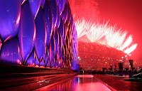
In Year 2008, Olympics was held in Beijing, China. They made new innovations on the stadiums, the Water cube and the Bird’s nest. Beijing National Stadium was a joint adventure among architects Jacques Herzog and Pierre de Meuron of Herzog & de Meuron, project architect Stefan Marbach, artist Ai Weiwei, and CADG which was lead by chief architect Li Xinggang. Both stadiums are inspired by daily things, bird’s nest and water. Chinese make bird’s nest into food in life, especially in some special occasions. This Bird’s nest stadium represents the traditions and habit of Chinese people. Also, the Bird’s nest stadium has become known as the world's largest steel structure and the most complex stadium ever constructed. Other than the Bird’s nest, Architects want to do something different for the swimming stadium. “We wanted to do something different from Herzog & de Meuron’s design,” recalls Tristram Carfrae, the leader of the Arup delegation. “Theirs was red and round, so ours would be blue and boxy.” And they did a great job. They made the swimming stadium as if it is a water cube and it looks like it can be float on water due to those entire bubbles surface. There’re colors changing on the water cubes at night which people can see from far away. As we can see, these two stadiums are inspired by the surroundings and architects did a good job on being creative of their environment and made us two beautiful and magnificent stadium. To learn more about how it is built, press here.

2010年10月4日 星期一

Vitasoy


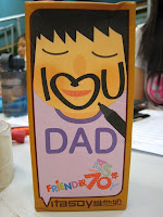
Vitasoy is the famous brand of beverage in Hong Kong. To celebrate the 70th anniversary of the company, they came out with a collection of 70 new designs in the title of '"Stand by me" for the next 70 years'. I still remember that time when these new collections were released, I was still in the US. I saw quite some friends started posting different designs of the package on facebook and people seemed to be very interested and engaged into this new idea. Every design have a line or a sentence of wishing words or kind words on it, and people can give them to their friends or families as a way to express their feelings. I got few examples of these designs from my friend. Some are really engaging words like "I am stupid and you are an idiot, that's why we are friends.", "I <3 you Dad", "wish you don't sleep at class anymore", "Get a girl friend soon “and many more. 
As a well known beverage branding in Hong Kong, I think Vitasoy did a great job on this new designs as it suits everyone in the society. They make beverage like soy milk, lemon tea, etc which basically the customers target for their drinks are any type of people in the society. In person, these new collection of designs well fit their drinks as those kind works can be said to everyone in the society. The designs are also well combined with words. For instance, the "I <3 you Dad" with the little boy's face and the "get well soon" with the broken leg are both beautifully illustrated. The colorful and simple designs are very straight forward and receiver can get the message directly from first looking at the design.


2010年10月2日 星期六

T-Post ?!

People say design is all around,but how?
There was an idea born in 2004, the "T-Post"!
"Offbeat news + graphic t-shirt = T-post"
The T-Post was the first wearable magazine, they started out by making 5 copies of t shirt and they're now world spreaded to over 50 countries. Once you have subscripted to T-Post, you will receive a t shirt within three weeks. After that, T-Post will send you new t-shirt every five weeks.The design of the T-shirt will be about one of the current news topic of a month and subscribers will not know what the designs are until they receive it.T-Post is somewhere between a column and a new story that mainly make people opens up new ideas and thoughts.There are tees that can inspire conversation and tees that can inspire movement, T-Post do both!  T-shirt is no longer something that represent you or the designer, it'a about the world.  Some T-Shirts are limited edition and specially designed which you may play "Rock,Paper Scissors" with and play air drums to your favourite song. The youtube video below is a sample of the air drum t-shirt.

The T-Post production doesn't sounds very environmental friendly? The highly production of organic cotton tees uses a lot of natural resources. However, they're now using printers that are environmentally certified and ink that are eco-friendly.For more information or subscribtion , you may click on T-Post.
 

Mannequin


Thinking of a design that inspires me, Gareth Pugh is the first thing that pops up in my head. Remember seeing his 2007 Spring Ready-to-Wear collection, I was totally admired. There were two special designs that stuck in my mind. First off, models were fully covered with black shiny textile which made their body and face a more 3D geometrical protrusions. Gareth Pugh's design are mysterious and nonsensically shaped, but at the same time; they look surprisely high fashion and stylistic. His designs are simple, but tricky. The checkerboard greatcoat is ordinary, but the way it comes along with a very high shoulder pad and linked with the hood brings viewer a uncanny mood to the design. The little gold chain at the waist interested the whole design by adding another focus point with it's color and shape. The girly black leather high heel shoe also gives us a very different feeling to the whole mysterious design.


The other model is wearing a black dress that made with permanent holes on it .The permanent of the dress emphasized the beauty of human body and lines. The focus of this design is the triangular shaped should and arm. They gives a very egdy and powerful feeling to the simple dress, the triangular satin pattern on it also give a sense of details. The way the model is wearing a black mask gives the mysterious feeling to the whole design as well. The gold hair band also add a little color to the black which reduce the doleful feeling of the whole.

2010年10月17日 星期日

Compare and Contrast - Pense Gallery


Last week, I went to the Pence Gallery for the “12 Voice” Exhibition. There’re quilts from different artists with distinct styles and representations. The use and combination of organic shapes and colors bring out individual feeling and messages to art pieces. From the pile of collection, the “Book of Hours 4” by Joan Schulze is the first piece I fell in love with at the first sight.

“Book of Hours” 4 was made in 2008 at Sunnyvale, California. Artist, Joan Schulze, stated that “It is not a question of realism, but of finding new and fresh visual thinking…” This quilt is made by collaging variety pieces of textiles and images together. They’re made by silk, cotton and paper. Main techniques that Schulze used was glue transfer process, machine pieced and quilted. There are piecing and stitching of different pieces with variety of textiles and photographs. If you see close up, there’re diagonal lines of sewing to balance with the vertical and horizontal combination of fabrics.

Personally, I like the way it has so many information in a piece and our eyes are busy going around the piece, interpreting different ideas and messages from the artist. The shapes and color use are also my favorite things of the piece. Schulze used subtle colors in the center of the piece, like pure blue and grey to reduce the business of the whole piece. The brighter color use, like orange, light blue, cyan and dark colors around the edge are appealing as well. Even though the piece is combined by different small pieces of fabrics, I like how some patterns sort of connect together by repeating shapes and connecting lines. I also enjoy how Schulze uses images and textures, yet they look quite united putting together. Moreover, Schulze added some yellow paint at the top of the piece to create a focus point from the busy and informational patterns. 


The other piece that I’m interested in is “Journey” by Linda Colsh. It’s made in Belgium at 2006. Colsh says “Each of my quilts in 12 Voices is a narrative about a real person whom I photographed…knowing nothing about her, I think about her, and draw or write about her in my notebooks. “ Colsh develop her character and made up the life and background. As we can see, Colsh mainly uses pale and cold colors for this piece which is totally different from the warm and enthusiastic color of the form piece which really matches with the loneliness from the character’s back. Instead of combining cotton patches, Colsh painted and printed some of her photographs and drawings and collage them together. Even though there’re also some different sizes of patches combining together, it looks less busy than the former one because of the textile and tone of the whole. The three black vertical lines helped direct where viewer’s eye should go and made a focal point for the piece. The repetition of pattern, the person’s back view, at both horizontal edges also balances out with the black lines.

Compare and Contrast- UC Davis vs. Foothill College


Thinking of a comparing and contrasting a design, it’s hard to pick one from the pile. Remember I was super amazed by the design of the econ building at UC Davis when I first saw it and I totally fell in love with the design of the building. Let’s make a comparison and contrast with the econ building and my previous college, Foothill College. I took some photos at the econ building last week, and I really adore the simple and modern concrete design. The designer had a great use of lines and they looks good with the shadow together. The concrete gives the sense of simple, yet there’s beautiful textile on the surface to reduce the dullness. The concrete walls combined with glass are a combination of modern designs. On the other hand most of the buildings and classrooms in Foothill College are made in wood. Yet they are mostly one floored with bricks housetop. However, they seem to put in more green to the campus. However, the admission center of Foothill College also looks similar to the econ building of UC Davis. They’re mostly made in concrete but combining wood together. The lines of lightings at night also give the sense of modern similar to the econ building in UC Davis. However, even though they uses similar materials, I think the design of the econ building in UC Davis are very tricky .You may find a lot of geometric shapes or interesting compositions throughout the building if you spend time observing it. Here’re some photos of the econ building I took last Friday and photos of Foothill College I found on the interenet.

Design as conversation - Old Spice


Remember I was working at an international advertisement company, JWT, last summer in Hong Kong. "Advertisements" remind me of design as a conversation. We see advertisements everywhere anytime. Advertising are on the internet, television, newspaper, flyers and more. It's everywhere and so close to us that sometimes we're unconscious about it. Imagine the world without advertisements. I’m pretty sure the part of the society will stop running. Yet, what are the elements of making a memorable and successful advertisement that always stick on viewer's mind?

I'm sure you've seen a lot of cool advertisements during the super bowl. If you ask me to think of the most memorable advertisement that I've seen
, the first one that pops up to my mind is the "Old Spice" shampoo commercial,"the man your man could smell like me". There're psychological elements in it which the black guy in the commercial talks every script really fast and limit viewer’s time of thinking. The repeating sctipt,"Look at your man!","Back at me","Now back to your man","Now back to me" produce an illusion to the women which makes them think man who use old spice shampoo are much better. On the visual aspects, there is beautiful scene, like on the boat and luxuries like diamonds to attract people's attention. The commercial reached over 10000000 hits on youtube after the super bowl. In a month after the commercial, the sales of old spice body wash increased 27% from the former year and sales rapidly increased in time. To know more about the case study of the “Old Spice” advertisement, check out this out .

2010年10月11日 星期一

Stone Soup


The stone soup experience not only allows us to produce an art piece, it’s also a chance learning how to work with others as a team. Ingredients of our stone soup are mainly paper boxes, newspaper/magazines, strings and the lantern shaped decoration from our mentor. When we first arrived the place, it felt kind of weird as we don’t know each other very well and everyone was quiet. Then we took out materials that we have bought and Noelle, the mentor, asked us to plan ahead or maybe sketch out any ideas. Yet, it’s kind of hard to think of any ideas just by seeing what materials we have. Therefore we just started right away by making something out or maybe putting things together. We used the lantern shaped thing as a head and hanged it on to the tree, we then used another lantern combined it with soft drink cans and put it along the head as a body. As there’s a paper box, we hanged it along and there’re words “tips are welcome” on it. There’re also some extra decoration of cut color papers that put along the string that tied up the main subject, so the strings look better and sort of tie together with the main subject than just being a string. The stone soup seems to be quite satisfied for everybody in the team and it brought a memorable experience for my first time doing art work outdoor with a group of people.

Architecture


There is only one moment when you can link fashion and architecture together and that is design a dress inspired from architecture. The Marchesa fall 2008 collection is a tribute to Queen Elizabeth 1 and every dress in the collection are inspired by temples and buildings. The color use of this collection is mainly black, white and red which match with the colors of temples and buildings. The brand “Marchesa” is established by Georgina Chapman and Keren Craig Marchesa and its well known for the modern aesthetic of putting signature draping and layers of textiles together. Take this black dress as an example. Designer use different elements from the building like the color and textile and put them into the dress. As we can see, the surface of the building is smoother than normal buildings. Designers use a smooth textile such as silk or satin as the textile for the dress. The color of the textile from the dress is also in black, which makes more sense as the building is in the color of black as well and bring the subtle feeling out of it. On the other hand, the most significant characteristic from the building is its convolute stairs outside the building. Designers made some layers of the bottom of the dress to bring out the whirling feeling. Designers took out the significant elements from the building and display them on a dress. They emphasize on the elegant feeling of architecture and combining signature exclusive textiles into the dresses. To see the whole collection of the design, press here.

Bird nest and water.


In Year 2008, Olympics was held in Beijing, China. They made new innovations on the stadiums, the Water cube and the Bird’s nest. Beijing National Stadium was a joint adventure among architects Jacques Herzog and Pierre de Meuron of Herzog & de Meuron, project architect Stefan Marbach, artist Ai Weiwei, and CADG which was lead by chief architect Li Xinggang. Both stadiums are inspired by daily things, bird’s nest and water. Chinese make bird’s nest into food in life, especially in some special occasions. This Bird’s nest stadium represents the traditions and habit of Chinese people. Also, the Bird’s nest stadium has become known as the world's largest steel structure and the most complex stadium ever constructed. Other than the Bird’s nest, Architects want to do something different for the swimming stadium. “We wanted to do something different from Herzog & de Meuron’s design,” recalls Tristram Carfrae, the leader of the Arup delegation. “Theirs was red and round, so ours would be blue and boxy.” And they did a great job. They made the swimming stadium as if it is a water cube and it looks like it can be float on water due to those entire bubbles surface. There’re colors changing on the water cubes at night which people can see from far away. As we can see, these two stadiums are inspired by the surroundings and architects did a good job on being creative of their environment and made us two beautiful and magnificent stadium. To learn more about how it is built, press here.

2010年10月4日 星期一

Vitasoy


Vitasoy is the famous brand of beverage in Hong Kong. To celebrate the 70th anniversary of the company, they came out with a collection of 70 new designs in the title of '"Stand by me" for the next 70 years'. I still remember that time when these new collections were released, I was still in the US. I saw quite some friends started posting different designs of the package on facebook and people seemed to be very interested and engaged into this new idea. Every design have a line or a sentence of wishing words or kind words on it, and people can give them to their friends or families as a way to express their feelings. I got few examples of these designs from my friend. Some are really engaging words like "I am stupid and you are an idiot, that's why we are friends.", "I <3 you Dad", "wish you don't sleep at class anymore", "Get a girl friend soon “and many more. 
As a well known beverage branding in Hong Kong, I think Vitasoy did a great job on this new designs as it suits everyone in the society. They make beverage like soy milk, lemon tea, etc which basically the customers target for their drinks are any type of people in the society. In person, these new collection of designs well fit their drinks as those kind works can be said to everyone in the society. The designs are also well combined with words. For instance, the "I <3 you Dad" with the little boy's face and the "get well soon" with the broken leg are both beautifully illustrated. The colorful and simple designs are very straight forward and receiver can get the message directly from first looking at the design.


2010年10月2日 星期六

T-Post ?!

People say design is all around,but how?
There was an idea born in 2004, the "T-Post"!
"Offbeat news + graphic t-shirt = T-post"
The T-Post was the first wearable magazine, they started out by making 5 copies of t shirt and they're now world spreaded to over 50 countries. Once you have subscripted to T-Post, you will receive a t shirt within three weeks. After that, T-Post will send you new t-shirt every five weeks.The design of the T-shirt will be about one of the current news topic of a month and subscribers will not know what the designs are until they receive it.T-Post is somewhere between a column and a new story that mainly make people opens up new ideas and thoughts.There are tees that can inspire conversation and tees that can inspire movement, T-Post do both!  T-shirt is no longer something that represent you or the designer, it'a about the world.  Some T-Shirts are limited edition and specially designed which you may play "Rock,Paper Scissors" with and play air drums to your favourite song. The youtube video below is a sample of the air drum t-shirt.

The T-Post production doesn't sounds very environmental friendly? The highly production of organic cotton tees uses a lot of natural resources. However, they're now using printers that are environmentally certified and ink that are eco-friendly.For more information or subscribtion , you may click on T-Post.
 

Mannequin


Thinking of a design that inspires me, Gareth Pugh is the first thing that pops up in my head. Remember seeing his 2007 Spring Ready-to-Wear collection, I was totally admired. There were two special designs that stuck in my mind. First off, models were fully covered with black shiny textile which made their body and face a more 3D geometrical protrusions. Gareth Pugh's design are mysterious and nonsensically shaped, but at the same time; they look surprisely high fashion and stylistic. His designs are simple, but tricky. The checkerboard greatcoat is ordinary, but the way it comes along with a very high shoulder pad and linked with the hood brings viewer a uncanny mood to the design. The little gold chain at the waist interested the whole design by adding another focus point with it's color and shape. The girly black leather high heel shoe also gives us a very different feeling to the whole mysterious design.


The other model is wearing a black dress that made with permanent holes on it .The permanent of the dress emphasized the beauty of human body and lines. The focus of this design is the triangular shaped should and arm. They gives a very egdy and powerful feeling to the simple dress, the triangular satin pattern on it also give a sense of details. The way the model is wearing a black mask gives the mysterious feeling to the whole design as well. The gold hair band also add a little color to the black which reduce the doleful feeling of the whole.